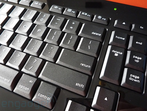
Unless you've got a couple thou to shell out for an Optimus Maximus, Logitech's diNovo Edge is about as slick a keyboard as anyone makes right now. We just cracked open the forthcoming diNovo Edge for Mac -- comparison shots are below, but the differences aren't too stunning.
- Mac keys, and lots of 'em. Not just command, option/alt, etc., they've got the full complement, including Dashboard, Spaces, Quick Look, Front Row, iTunes (plus media controls), brightness up/down, and so on.
- Unfortunately, unlike its PC counterpart, those media and shortcut buttons are not hidden behind the black mirror finish until lit up.
- The keyboard font's changed to something a little thinner and larger. Definitely easier to see, but we'd still like a backlight.
- There's no Bluetooth connect button anymore -- it's smart enough to automatically go into discoverable mode if it's not paired.
- The Mac keyboard stack makes all those shortcuts configurable if you're using the function keys as, well, function keys.
[ Via: Engadget ]
[ Tag: apple,dinovo,dinovo edge,DinovoEdge,logitech ]